Dashboard & SaaS Design
Dashboard & SaaS Design
from €213,70
Complex data made clear. We design admin panels, analytics dashboards, and SaaS interfaces that people can actually use without a manual.
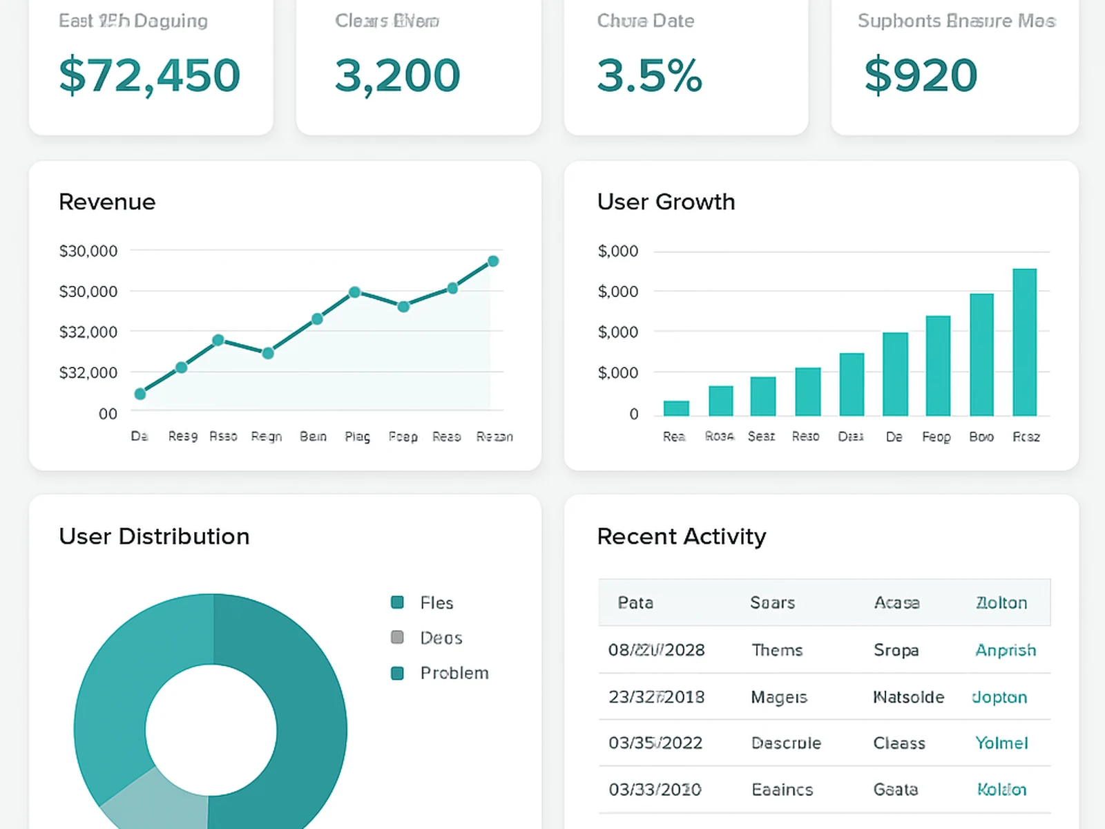
Complex data made clear. We design admin panels, analytics dashboards, and SaaS interfaces that people can actually use without a manual.
Dashboard design is hard because you are dealing with lots of data that needs to be organized in a way that helps people make decisions fast. The challenge is not showing everything at once. The challenge is showing the right thing at the right moment and making it easy to act on.
The most important number should be the first thing someone sees when they open the dashboard. Then context. Then details for people who want to dig deeper. We design in layers: the overview level for quick checks, the detail level for analysis, the action level for making changes.
Charts should answer a specific question. We pick chart types based on what the data is saying, not what looks impressive in a pitch deck. Bar charts for comparison, lines for trends, tables when you need exact numbers. No 3D pie charts. Ever.
Online · Amposta